Warm vs cool lighting for interiors: colour temperature and placement
Colour temperature changes how a room feels, but Kelvin is only one part of good lighting. Combine an appropriate tone with enough lumens, accurate colour rendering, controlled glare and layers placed where people actually sit, cook, read and relax.
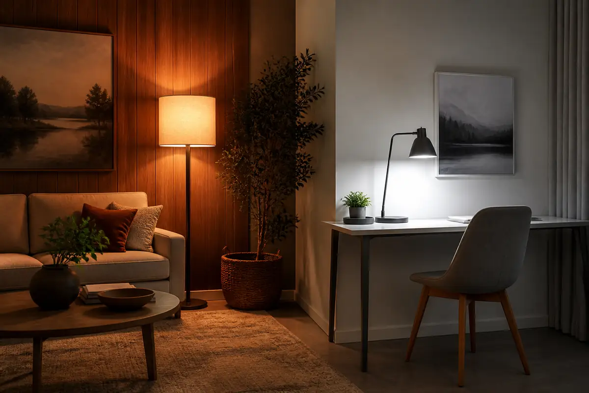
Use warm light for rest, clearer light for tasks—and test it in context
Around 2700K often suits living rooms and bedrooms; 2700–3000K covers much general domestic lighting; 4000K can work for task-led kitchens, utility rooms and some bathrooms. Do not select on Kelvin alone. Check lumen output, CRI, beam spread, shade, surface colours and dimmer compatibility. Two lamps marked “warm white” can still render a room differently.
Kelvin describes the apparent colour of white light, not heat output or brightness. Lower numbers look warmer and more amber; higher numbers look cooler and bluer. Product naming is not perfectly consistent, so compare the number as well as the words.
Choose a starting range by use
| Area | Starting tone | Why it often works | What to adjust |
|---|---|---|---|
| Living room | Very warm to warm, about 2700K | Relaxed evening atmosphere | Add a clearer reading lamp if needed |
| Bedroom | About 2700K | Less visually stimulating late in the day | Shield bedside glare |
| Kitchen | 3000–4000K by zone | Clearer task visibility | Keep dining light warmer |
| Bathroom | 3000–4000K | Useful clarity for grooming | Prioritise colour rendering and safe fitting |
| Home office | 3000–4000K | Task contrast without an icy feel | Balance screen and room brightness |
Record these six specifications
- Colour temperature in Kelvin, not only “warm” or “daylight”.
- Lumen output for brightness.
- Colour rendering index, especially for food, art, clothes and makeup.
- Beam angle or shade direction.
- Dimmability and stated dimmer compatibility.
- Cap type, physical dimensions and whether the LED is replaceable.
Kelvin is mood, not brightness
A dim 4000K lamp is still cool in tone; a powerful 2700K lamp is still warm. Lumens describe light output, while wattage describes electrical input. Modern LEDs can produce similar lumens at different wattages, so replacing a bulb by watt number alone can make a room unexpectedly dark.
Energy Saving Trust gives 2700–3000K as a useful general household range and notes that 4000–4500K may suit bathrooms or kitchens. Treat these as starting points, not rules. A north-facing kitchen with grey finishes can feel stark at the cool end, while a dark worktop may need more task light regardless of Kelvin.
Layer ambient, task and accent light
One bright ceiling fitting often creates a pool of light below and shadows where hands work. Ambient light supports movement and general orientation; task light serves reading, chopping, sewing or grooming; accent light adds depth to a wall, shelf or plant. Separate circuits or lamps let the room change between activities.
In a living room, combine a modest central or bounced source with floor and table lamps below eye level. In a kitchen, illuminate worktops from the front or above so your body does not cast the main shadow. Before buying decorative pieces, use the product shortlisting guide to separate required light from style preferences.
Keep colour temperature coherent within a view
Mixing temperatures can be purposeful: a warmer dining pendant and a clearer worktop strip can define zones. Problems arise when several bare lamps in one sightline vary randomly, making white walls appear patchy. Group sources by task and sightline rather than forcing the entire home to one Kelvin.
If an open-plan room combines kitchen, dining and sitting areas, choose adjacent steps—perhaps 3000K task light and 2700K decorative light—then test them together. Avoid a severe amber-versus-blue split unless it is a deliberate theatrical effect.
Check CRI when colour decisions matter
Colour rendering index estimates how faithfully a source reveals colours compared with a reference. Energy Saving Trust says CRI 80 or more is good for most household tasks. For artwork, textiles, food preparation or makeup, a higher and more consistent rendering specification can be worthwhile, but one headline CRI number does not describe every colour sample.
Warm light tends to flatter timber, terracotta and warm fabrics; cool light can sharpen blues, greys and white work areas. That does not mean one “matches” a palette automatically. Our wood-tone guide explains undertone and contrast, while the bedding colour guide helps assess textiles in the light used at night.
Control glare before adding more lumens
A bright point source in the direct line of sight can feel uncomfortable even when the room is under-lit elsewhere. Use shades, diffusers, wall washing or indirect reflection. Position reading lamps beside and slightly behind the shoulder, then adjust to avoid page shadows and reflected glare.
For screens, balance the brightness around the display without shining directly into it. In bathrooms, side lighting near a mirror can reduce harsh facial shadows compared with one downlight overhead. Electrical zones and fitting ratings matter around water, so use a competent electrician where installation is involved.
Test the room’s surfaces at night
Paint, timber, metal, stone and textiles reflect light differently. A glossy white kitchen can amplify glare; deep matt walls absorb more light; warm timber shifts the perceived result. Test after sunset because daylight can hide a mismatch. Move a portable lamp or use returnable sample bulbs before committing to integrated fittings.
Place a white sheet, a familiar garment and a colourful object in the intended zone. Look for comfort, colour separation and shadows rather than deciding from the bare bulb. If art is central, the wall-art sizing guide helps place both artwork and lighting within the same visual field.
Dimming can change output and colour behaviour
Not every LED is dimmable, and an old dimmer may flicker, buzz, fail to reach low levels or cause a lamp to stay faintly lit. Check the bulb, driver, load range and control compatibility. “Dimmable” on one component does not guarantee the complete circuit will behave well.
Standard LEDs usually become less bright without becoming dramatically warmer. “Dim-to-warm” products intentionally lower colour temperature as output falls, closer to the feel of incandescent light. Decide whether that transition matters before paying more. For wired changes, consult an electrician rather than trialling incompatible controls.
Choose replaceable lamps or integrated fittings consciously
A replaceable bulb lets you change Kelvin, lumens or the failed component without replacing the whole fitting, but cap type and shade space limit options. Integrated LED fittings can be slim and evenly diffused, yet a failed driver may make the whole unit a repair question.
Ask for rated life, warranty, replaceable parts and driver access. The cheapest integrated fitting is poor value if it is difficult to service. Use the total-cost framework to include installation and replacement labour, not just lamp energy.
Make rental changes reversible
Tenants can often improve a room with plug-in floor lamps, table lamps and compatible replacement bulbs, while keeping the landlord’s originals. Cable management must remain safe and routes should not create trips. Do not overload adaptors or alter fixed wiring without permission and competence.
The rental-friendly decorating guide covers reversible layout choices. A well-placed portable lamp often improves comfort more than an adhesive decorative light with poor output and uncertain electrical quality.
Audit one room before standardising the house
- List activities and where eyes and hands are positioned.
- Measure existing bulb cap, size and lumen output.
- Choose a Kelvin starting range for each zone.
- Check glare, shadow and CRI against real surfaces.
- Test at night and note which switches control which layers.
- Only then repeat a successful specification elsewhere.
For an unfamiliar electrical seller, run the online-shop authenticity checklist and retain model information for safety notices.
The room is for evening rest
Living, dining and bedroom zones benefit from softer atmosphere, especially with timber, warm textiles and low-level lamps.
The task needs visual accuracy
Cooking, grooming, laundry and desk work may benefit from neutral-to-cooler light, provided glare and colour rendering are controlled.
Balanced verdict
Warm versus cool is not a contest with one winner. Choose colour temperature by activity and atmosphere, then make the result work with enough lumens, good colour rendering and careful placement.
Start warm in rest spaces and move clearer only where a task benefits. Test the actual room at night before buying a houseful; shade, surfaces and beam shape can outweigh a small difference on the Kelvin label.
Check current official information:
Energy Saving Trust lighting guidanceUK product safety alerts and recallsElectrical Safety First home guidance
Frequently asked questions
Is 3000K warm or cool?
It is generally described as warm white, though it looks clearer than 2700K. Product naming varies, so compare the Kelvin number.
Is cool-white light brighter?
Not necessarily. Brightness is described by lumens. A cooler source can appear crisper, but compare lumen output separately.
What colour temperature is best for a living room?
Around 2700K is a useful starting point for relaxed general lighting, with a separate task lamp where reading needs more clarity.
Can warm and cool bulbs share one room?
Yes, when they define different zones and do not create distracting patchiness. Keep neighbouring sources reasonably coherent.
What CRI should I buy?
Energy Saving Trust says 80 or more is good for most household tasks. Colour-critical uses may justify stronger, better-documented performance.
Why does my LED flicker when dimmed?
The lamp, driver, dimmer or load range may be incompatible. Stop using a visibly faulty setup and seek competent advice for fixed wiring.
How we researched this guide
Recommended Today reviewed current Energy Saving Trust and electrical-safety guidance. We compared colour temperature with lumens, CRI, glare, beam control, room surfaces, replaceability and dimming rather than treating Kelvin as a standalone score.
Limitations
We did not perform photometric measurements or specify lighting for a particular building. Perception, vision needs and installations vary; recheck specifications and electrical guidance on publication day. The original image shows a fictional unbranded room with distinct warm ambient and cooler task zones and no readable controls, labels, logos or prices. Links are editorial and non-affiliate.