Wardrobe colour planning online: undertone, saturation, texture and outfit fit
A useful colour plan is not a rigid palette or a promise that every neutral matches. It is a way to predict outfits before ordering: compare undertone, lightness, saturation, texture and contrast, then buy only when the new garment works with pieces you genuinely wear.
In this guide
Plan relationships between garments, not a row of colour names
Choose two or three dependable base families, then add accents that connect to real outfits. Screen colour is uncertain, so use material descriptions, multiple photographs and a return-safe test. Texture and contrast often decide whether two “matching” shades cooperate.
Begin with the clothes already doing the work
Pull out the items worn repeatedly in the relevant season and setting. Ignore aspirational purchases and one-off occasionwear. Photograph complete outfits in consistent daylight, then note which trousers, skirts, outer layers and shoes make combinations easy. The aim is not to discover a flattering universal palette; it is to see what your actual wardrobe supports.
The autumn capsule guide covers weather and layering, while the workwear capsule method deals with dress code and laundry. This guide addresses a narrower problem: deciding whether a colour visible online will earn enough outfit roles to justify the order.
| Colour property | Question | Evidence online | Common mistake |
|---|---|---|---|
| Lightness | How pale or deep is it? | Several views beside known colours | Treating every navy or cream alike |
| Undertone | Does it lean warm, cool or balanced? | Material description and daylight image | Matching only the colour name |
| Saturation | Is it muted or vivid? | Close-up and customer imagery used cautiously | Buying an accent too loud for normal use |
| Texture | How does the surface alter light? | Fibre, weave, pile and finish | Expecting matte wool and satin to read the same |
Create base families with room for variation
A base family might be cool dark neutrals, warm earth neutrals or soft low-contrast shades. It need not be one exact colour. Navy trousers and charcoal outerwear can cooperate even when they do not match; two near-identical blacks with visibly different fading can look accidental. Decide whether you want deliberate contrast or a tonal relationship.
For each base, list compatible footwear, outerwear and bag choices. These costly or frequently repeated pieces usually constrain the system more than tops do. If a new garment requires a new coat, shoes and underwear to function, the apparent single purchase is an outfit chain. Use the cost-per-wear framework to include that dependency.
Use undertone as a comparison, not a rulebook
Warm and cool language describes a relationship. A green may lean yellow or blue; a beige may lean pink, grey or yellow. The retailer’s name—stone, oatmeal, sand, mushroom—does not standardise the result. Compare the product against visible reference colours and fibres, and expect screens and editing to shift it.
Personal colouring systems can be useful prompts, but they should not replace comfort, identity, dress code or actual combinations. If a supposedly “wrong” colour is worn often and feels right, it is evidence. Place uncertain colours away from the face, use a familiar layer between them, or choose an accessory test before committing to an expensive coat.
Five-outfit checkout test
- Name five complete outfits using pieces you already own.
- Include footwear and the outer layer needed in real weather.
- Check whether underwear, hosiery or a base layer becomes visible.
- Confirm every garment can share a realistic laundry cycle.
- Identify whether contrast is intentional rather than a failed match.
- Save the listing and return conditions before ordering.
Account for fabric and finish
Colour is produced by material as well as dye. Brushed fibres scatter light; satin reflects it; ribbing creates shadow; sheer fabric mixes with the layer beneath; washed denim varies across seams. A black velvet jacket, black cotton T-shirt and black coated trouser may form a strong tonal outfit precisely because the surfaces differ. Two smooth synthetic blacks that are merely slightly different may be less convincing.
Read fibre and construction information with the colour. The fabric-composition guide explains what the label can establish, and the weight and opacity guide covers lining and transparency. A pale garment may need another layer that changes both colour and cost.
Do not trust one screen image
Display settings, brightness, white balance, studio lighting and compression all change colour. Compare every available retailer image, including close-ups, back views and video frames, but do not treat customer photographs as calibrated evidence. Look for a written colour description and whether the seller warns of variation.
If exact coordination matters—for a suit, uniform, bridesmaid group or replacement part—buy matching pieces from the same defined fabric and colour batch where possible, or request a swatch. Ordering two items called “black” from separate collections is not a colour-match strategy. For ordinary wardrobes, build enough contrast that a small shift does not break the outfit.
Decide how accents earn their place
An accent colour should repeat naturally or work with several bases. It may appear in a knit, scarf, shirt, shoe or jewellery, but repetition is not compulsory. The useful question is whether it creates outfits you want to wear. A dramatic one-off piece can be valid; it simply should not be disguised as a versatile basic.
Start with one accent garment and wear it before buying companions. Retail imagery often sells a complete colour story at once. That can convert uncertainty into several simultaneous orders. The shortlisting method helps separate the role from the retailer’s styled set.
Plan contrast around silhouette and use
High contrast draws attention to boundaries. A pale top with dark trousers emphasises the waistline; a dark column under a lighter coat changes the vertical line. Neither is inherently better. Consider the intended silhouette, visibility needs, workplace expectations and how outerwear interrupts the combination.
Patterns contain several colours at different proportions. Identify the ground colour from a normal viewing distance, not every tiny motif. A patterned garment is versatile when its dominant colours connect to the wardrobe and the pattern scale suits the intended layer—not simply because one small fleck matches a shoe.
Test the delivery in honest light
On arrival, keep tags attached and inspect the garment in indirect daylight and the lighting where it will be worn. Compare complete outfits rather than holding two fabrics together under a single bulb. Photograph from normal distance. Check opacity, shine, colour transfer and whether the surface changes when stretched.
Do not wash to “see the real colour” while deciding on a change-of-mind return. The first-wear care guide covers safe checks and colour-transfer planning after the decision. For the return window and hygiene restrictions, use the UK clothing returns guide.
Keep a personal colour record
Save successful product photographs alongside your own daylight image, fibre content and notes such as “cool charcoal; works with navy and burgundy” or “cream becomes yellow beside white shirts”. The record is more useful than retailer names alone and reduces repeated returns. Record failures too: a beautiful shade that only works with one unworn skirt is not a wardrobe base.
When garments fade or pills change the surface, reassess relationships instead of automatically replacing them. The repair, rotate or retire guide helps decide whether a colour or condition change still supports useful wear.
Buy the colour when
- It creates at least five honest outfits.
- Its contrast works with your silhouette and setting.
- Fabric, opacity and care fit the intended role.
- The return route allows a calm home comparison.
Pause when
- The decision depends on an exact screen match.
- It needs several extra purchases to function.
- Only styled campaign images show the shade.
- You are buying a whole palette before wearing one piece.
Balanced verdict
A good wardrobe colour system creates tolerance, not restriction. It helps pieces cooperate even when dye lots, fibres and screens vary. Base families provide repetition; deliberate accents provide interest; texture prevents a palette from becoming flat.
Use real outfits as evidence, accept that exact online colour is uncertain and keep enough contrast for small shifts. When the new garment works only under one photograph or requires a new supporting wardrobe, the colour plan has exposed a weak purchase rather than failed.
Official UK sources
Frequently asked questions
How many colours should a wardrobe use?
There is no correct number. Use enough base and accent families to support real outfits without forcing exact matches.
Can online colour photographs be trusted?
They are useful but not calibrated. Compare several views, written descriptions, fibre and finish, then test within the return window.
Do all black clothes match?
No. Undertone, fading, fibre and finish alter black. Either seek a documented matching set or make the texture contrast deliberate.
Should shoes and bags be the same colour?
Not necessarily. They need to cooperate with the outfit; repetition, tonal contrast or a deliberate accent can all work.
What is the simplest checkout test?
Name five complete outfits including shoes, outerwear and realistic layers, using items you already wear.
Should I wash a garment before deciding?
Not for a normal change-of-mind test. Inspect carefully with tags attached and read the return policy first.
How we researched this guide
Recommended Today combined current UK textile and product-information guidance with a wardrobe decision framework based on lightness, undertone, saturation, texture, outfit compatibility, care and return risk.
Limitations
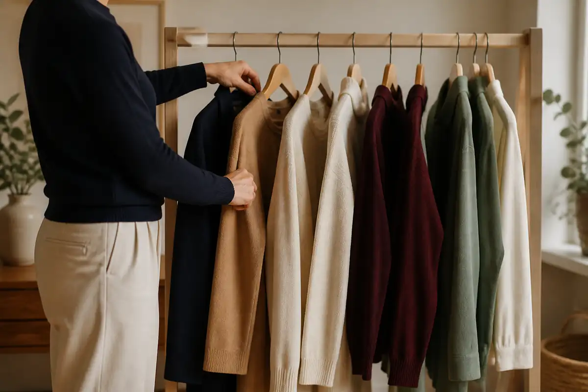
Colour perception, displays, lighting, dye lots and personal preferences vary. Recheck product photographs, fibre information and return terms before purchase. The image is an editorial illustration, not a photograph from a product test.